Browser statistics – time to wake up!

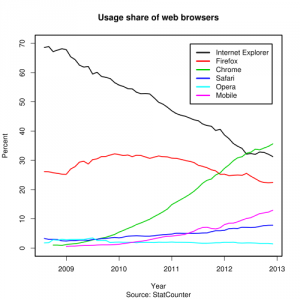
Usage_share_of_web_browsers_(Source_StatCounter).svg

Hello World! Time to wake up and smell the browser statistics of 2013! All of those sites and developers who still claim that you need Internet Explorer for viewing or using their site needs to wake up.

According to several sources Chrome is now the individually largest web browser at roughly 35% market share. Noteable exception from this statistic is tracking done by NetApplications that pegs Chrome at only 19% (and Internet Explorer at 54%). Still, 19% market share means almost one in five visitors use Chrome!

It’s time to let go of the past. Reverse your conditions and say that this site is best view in ANY web browser EXCEPT old Internet Explorer versions. Adhere to standards instead of individual browser versions. A website can be made to look and work almost identical in majority of web browsers (including the latest version of Internet Explorer) if one simply takes the effort to learn how to do that.

The only case when I can accept shortcuts with limiting testing to a single browser (and even version) is for intranet applications in a controled environment. The rest of the world should head for the future and develop for Chrome, Safari, Firefox, Opera and of course also Internet Explorer!

Installation av Internet Explorer 9

Idag skulle jag installera Internet Explorer 9. I någon form av respekt för Microsoft använde jag Internet Explorer 8 när jag skulle ladda ner den nya versionen. Jag gick till Microsofts hemsida för att ladda ner den men jag fick ett felmeddelande när fil-nedladdningen skulle börja. Då det inte fungerade tog jag fram Firefox 4, då startade nedladdningen direkt…

Ny Explorer – Nytt gränssnitt

När jag studerade på universitetet så kommer jag ihåg hur vi läste om Microsoft och hur de skröt om sina användaranalyser. De hade till och med haft en utredning om från vilken vinkel en ikon skulle kasta skugga för att vara som mest “användarvänlig”.

Min fråga är, var tog den avdelningen vägen!? I varje ny version av någon produkt från Microsoft de senaste åren har de vänt upp och ner på sitt eget gränssnitt. Microsoft Office 2007 fick en total makeover. Windows Vista (eller ska jag säga Windows 7 eftersom ingen körde Visa?) möblerade om ordentligt i filhanteringen. Nu kom nyligen Internet Explorer 9 och visst har Microsoft lyckats med att förvirra även där.

En så pass “enkel” sak som att ladda hem en fil. Denna funktion har fungerat i stort sätt oförändrat i Internet Explorer sedan version 4. I senaste versionen av Internet Explorer så kommer denna dialog inte upp som vanligt utan lägger sig istället som en liten informationsruta längst ner i Internet Explorer. Vilken användarvänlighetsexpert kom på detta? Jag kan inte komma på någon fördel med att “gömma” den längst ner i bilden?

En av de återkommande anledningarna jag hört för att använda Microsofts programvara är att “användarna känner igen sig”. Nu har snart Microsoft sänk sig själva med detta.

Missuppfatta mig inte nu, Microsofts produkter är bra men de är inte oersättliga. Om de fortsätter med att missgynna sina trogna användare så kommer de nog att tappa i sin för närvarande dominerande marknadsställning.

2009 – the year of the browsers

In 1989 we had zero web browsers as we know them today, allthough just about to be invented around the corner. In 1999 we had two web browsers fighting a death match, Internet Explorer and Netscape Navigator – a fight with Netscape cleverly lost by dying and coming back several open source reincarnations of which Firefox of course is the most well known today. 2009 is turning out to be yet another battle year for browsers, this time many more of them! We have (in no special order) the newcommer Google Chrome fighting Firefox and Internet Explorer (mainly the PC-side). We have Opera who has cut out a piece of the action on several systems but shine mostly in portable devices. Safari is ruling the Macintosh but is starting to get some interference from Firefox.

Well that is now, what is next? I ready a post about current state of browser development, and many of the major browsers have a beta our that will maybe go live sometime during the next year. While this might be very good news for home users I am sure it will mean alot of work for someone like myself who create on-line applications. There used to be a lot of tuning to make web pages and applications look and work the same on the old “two major browsers”, now we have at least 5! Unless the browser developers makes a great effort to follow the rules of the standards each web page have to compensate for how a particular browser parses the data.

In the past Internet Explorer have seemingly intentionally ignored several standards in favour of making programmers like myself forced to make pages look good on their browser. Internet Explorer is afterall the dominating browser and it have to work. The question is if this strategy is allowed to continue. I really hope for the sake of us programmers that while there are five new browser versions about to be released that several of them will render the basic pages using the same rulset.

Google Blueprint CSS tutorial

This is a basic tutorial of the first use of Google Blueprint as a CSS layout.

Download Blueprint CSS
Download the main library att Google Code, at the time of this writing that is the file “Blueprint 0.7.1.zip”.
http://code.google.com/p/blueprintcss/downloads/list

There are three folders in the ZIP-file, first you have the “blueprint” folder which contains the ready to use CSS-files (ie.css, print.css and screen.css). While there are more files in that folder we will only concern ourselves with those in directly in the “blueprint” folder and not subfolders.

I will not go into detail about the two other folders, for your information the “lib” folder contains YAML source for the project and the last folder “tests” contains sample pages you can play around with if you’d like.

Fast reference PDF
There is a nice “cheat page” you can print out from a PDF, this is optional though but I found it very helpfull at least while learning the new classes.

Link the CSS-files
All you need to do is copy the three CSS-files in the “blueprint” folder into a directory of your choice in the main HTTP directory. I assume you put them in a subdirectory simply called “blueprint”. Next you need to link them in the HTML-files where you wish to use them, add the following code:

<link rel=”stylesheet” href=”blueprint/screen.css” type=”text/css” media=”screen, projection”>
<link rel=”stylesheet” href=”blueprint/print.css” type=”text/css” media=”print”>
<!–[if IE]><link rel=”stylesheet” href=”blueprint/ie.css” type=”text/css” media=”screen, projection”><![endif]–>

The first CSS defines how to display the page on normal monitors and projectors. The second file is for printing and the last file, surrounded with an IF condition to only be used by Internet Explorer, is specific instructions for the naughty web browsers that do not follow the standards.

Make a HTML file that uses the Blueprint
I assume you know HTML and CSS so I skip the basics and move straight to the new classes that blueprint offers. Simply put you need an outer DIV of the class “container” that will be the parent object of all others. Inside of this you can decleare HTML code as normal. A real simple first page could look something like this:

<div class=”container”>
<div class=”span-24 last”>
<h1>Hello World</h1>
</div>
</div>

The outer DIV is the container of all objects. The second div defines itself as a “span-24” and “last” class. Span-24 is the max width (950 pixels) and will span the entire area inside the container, last is added to signal this is the final column on this row (it’s also the only so in this case maybe a bit overkill).

Now after this it’s very easy to expand the concept, for example to make a “top headline and under menu + content” layout simply write:

<div class=”container”>
<div class=”span-24 last”>
<h1>Hello World</h1>
</div>
<div class=”span-4″>
The menu
</div>
<div class=”span-20 last”>
The content
</div>
</div>

This still doesn’t solve the more complex aspects of CSS-layout when you need everything to be “just right” but with an overall layout made this easy you can focus on the end tweaking instead of re-inventing the basic wheel everytime you need to make a new design.

Conclusion
The absolute best part about the Blueprint CSS is a “small” feature internally namned “rest.css” which is part of the “screen.css” file. This resets all browser settings to one single setting (Firefox, Internet Explorer etc all have slightly different default values for border, margins, padding etc) making cross platform development much much easier. Secondly, and the acctual main purpose, the ability to easily create new columns and layout modifications really improves start up development time of new designs. While the Blueprint CSS just have very basic settings it’s often these basic settings that screw up every new design I make since I tend to aim a little too high everytime I write a new CSS-class.
Firefox 3 evaluation

Firefox logoWith the release of Firefox 3 I finally made the switch on all my computers to have this as the main web browser instead of Internet Explorer that used to be standard on some of my windows machines (I have too many computers I use daily). There where several reasons I switched and I thought I’d publish them so perhaps other people could find the same benefits I saw.

First of all I have no love for Microsoft in general, while they have some good products I do not find Internet Explorer to be one of them. They seem to invest as little as possible in it and only making changes when “forced” by an outside source (take tabed browsing for example, it wasn’t included into Internet Explorer until Firefox started using it). I’d also like to point out that other web browsers like Safari and Opera might also be great but I haven’t had the time to get acquainted with them. This also only concerns desktop/laptop browsers, on my Wii and phone I use Opera!

Why did I choose Firefox as my main browser? Here is the simple list:

  • Security – this is probably the main reason. Firefox out of the box is a slightly lesser target for hackers at the moment but while that might change there are several other factors making Firefox the number one security choice and one of them is the addon NoScript. A really nifty little program that simply stops all scripts on all pages you visit. With a simple click you can activate a single domain to use scripts either always or just temporarily for your current visit. This really improves security while browsing the Internet. While some pages look terrible these days without scripting ability you can always choose to trust those that you want to visit (and remember you used to trust ALL of them). This still doesnt save you if your favourite site is targeted by a cross-site scripting attack but at least being conservative with who may run scripts on your computer makes the odds work against you being a target.
  • Speed – the rendering engine of Firefox 3 seems faster, I do not know if this is true of just a perception of mine. It may also help that I’ve installed AdBlock Plus. This is another great addon that makes you able to block all incoming adds before they are downloaded, you can either manually block different ad-vendors by domain or different filters or you can also choose to subscribe to a kind of blacklist filter. With the blacklist filter “EasyList” most of the ads are gone! Visiting ad heavy site used to be very slow but with all the flash graphics and different connections to ad servers but with the filter in place you get to download what you really came from and not all the crap the site tries to throw at you. I’ve also found this very helpfull while being out with my laptop and wanting to conserve the amount of traffic I use while browsing the web.
  • AddOns – I’ve allready mentioned two addons but still the ability to customize your browser deserves special mention as well. While the average guy might not be able to develop addons for Firefox the open interface makes it perfect for everybody wanting to add their own idea to the web browser. This is clearly a popular feature and when visiting the official addon site you can download almost anything you could think of to pimp your browser.
  • Privacy – while maybe not a reason to install the web browser at my own computers the privacy settings and features of firefox are very well to my liking, when I use a public computer I use Firefox if they have it since the ability to remove personal data is made so easy.
  • Bookmarks / History – a fresh take on bookmarks and history is made in Firefox 3. I don’t know if I’m alone in having stoped to add bookmarks for everything but the improvements really support my way of browsing. The history list is made part of the bookmarks with features to visit the latest sites (also available in most browsers with history of course) but also the most visited sites. If you choose to skip bookmarks all togheter (like I usually do) and just type the URL the dropdown that used to be only the domains is expanded with domain, icon, title and a small description of the site. This really helps casual browsing and is a nice looking feature.
  • Open Source – while not a major benefit in itself I am a strong supporter of open source and if there are two products, one open source and one proprietary software I would go for the open source alternative any day (on a private level, this might be different in a business point of view depending on the situation).

While there are major improvements in choosing Firefox there are of course also drawbacks. Most of these are minor and will probably change with time. There are a few sites that just doesnt work well in Firefox and one of them is my on-line bank which at the moment only accepts Internet Explorer. These sites are very rare though and I think most site administrators are adapting to the fact that Firefox is becoming one of the major browsers.

Firefox is no longer a browser trying to catch up with Internet Explorer, Firefox just took the lead. Now let’s see some healthy competition and more innovate features ahead in all browsers.